
Ears for Peers Chat Platform Case Study
Reinventing an anonymous hotline's chat platform
4 month Masters Capstone group project
UI/ UX Design | Mobile UI | Mental Health
Our goal was to create a new chat platform for an anonymous overnight hotline, designing it to support both students using the service and the hotline operators, and ensuring compatibility with the needs of the organization.
MY TEAM
Kelly Chin
Olivia Galarza
OnKee Min
MY ROLE
Client Communication
UX Designer
TOOLS
Figma, Canva
Whimsical, Miro
Qualtrics, Google Sheets
INTRODUCTION
A hotline's chat platform can do so much more than just connect two people.
A unique resource for the Tufts community, Ears for Peers (E4P) is an overnight peer support hotline that receives over 400 calls and texts from students in emotional crisis every semester. Given my team's shared passion for mental health, I pitched E4P as a client for our Masters Capstone Project.

E4P's Heroku website plays the basic role of a chat platform

Created in a year by a JumboCode student team, E4P's current "Heroku" platform needs upgrading, from minor accessibility tweaks to new features that support the organization's needs and logistics.
Our solution was two-fold.
1
For Peers (Students)
We redesigned the Peer end of the website with access beyond inclusivity in mind: access to alternative resources, access to support, and access to key information, for students in distress.

Peers can request to connect to an Ear for emotional support
2
For Ears (Operators)
We replaced the Ears' end of the website with a mobile app, aiming to provide support to Ears, with a collection of new features that matched their logistics and physical environment better.
Ears handle chat requests and provide support to Peers
Not a fan of reading? Check out my 3 minute overview of this project!

DESIGN APPROACH*
We adapted the Nielsen Norman design thinking approach and developed both solutions in parallel.
1. UNDERSTAND
Focus Group
Qualtrics survey (call logs)
Anonymous questionnaire
2. EXPLORE
Information Architecture
Low to High Fi Wireframes
Graphics Layer
3. MATERIALIZE
A/B Testing
Presentation/ Client Demo
Documentation
*This case study provides a summary of the new Peer Experience and then focuses on the new Ears App in greater detail.
SOLUTION 1
Redesigning the Peer Experience
From our user research, including 55 responses to an anonymous survey for the Tufts community, we identified key interactions to redesign: 1) seeking resources, and 2) waiting to connect.
The current "Heroku" website is clunky, lacks important information, and is difficult to read.


Students in emotional crisis need clear information about the purpose of E4P's service and its contact options.
Our redesign is clean and informative

Our landing page uses high contrast text, lists key information about the E4P service, and points to alternative resources during offline hours.


A calming alternative to the loading symbol
While students wait to connect to an Ear, the breathing bubble serves as a loading symbol and a calming method of emotional regulation.
The website's new look is also inspired by the calming hues of Ears for Peers' social media content.


A/B Testing with six participants validated our changes
Mitigating bias
A fully functional and polished live website just feels more real than a clickable prototype.
To even the playing field and avoid interfering with Ears' operations during usability testing, I created a simulated experience of the Heroku website on Figma using screenshots.

From participants' performance on testing tasks, responses to follow up questions, and ratings of the visuals and ease of use, our redesign performed better on all fronts.
"The design is relaxing and visually appealing"
"I like that I can switch easily from text to call"
"I love the breathing bubble... I get anxious while waiting and feel like hanging up, so this helps a lot"
Note: both clickable prototypes can be found at the end of this page.
SOLUTION 2
A new mobile app for Ears
Besides managing chats, this app allows Ears to access resources quickly, help each other, and fulfill logistical responsibilities through new features.
UNDERSTAND
Constraint: Our entire user base was anonymous...
Given the societal stigma around mental health, Ears for Peers is fully anonymous by design: Ears are required to stay anonymous, and students reaching out do not share their identity.

...but we had an advantage.
For 2 years, I was one of the Faces of Ears for Peers, representing the organization non-anonymously. I was able to leverage this position, my access to internal information, and my Ears alumni network to successfully conduct user research without compromising Ears' commitment to anonymity.
Focus Group with Ears Alumni

Ears Alumni are no longer anonymous and have tons of insight into Ears' experiences.
New Call Log Survey for Current Ears

I pulled data from 55 calls/ texts logged by Ears for real time feedback on their experiences.
1. The Ears' Room setup significantly affects their experiences.

When the phone rings while Ears are asleep, they must climb down the bunk bed to pick up, which is unsafe.
When recommending resources, Ears check resource lists on the wall, which is time-consuming.
2. Sometimes, Ears take longer to accept chat requests.
From our survey data, we found that Ears took over 30 seconds longer to pick up when they were: 1) asleep in the top bunk, and 2) using the Ears Desktop for chats.
Up to 8% of calls are hang-ups, which can happen when students get anxious while waiting.
3. Ears are so empathetic that they might break their own boundaries.
Sometimes, chats go on past 11 PM, and Ears on Shift 1 have to stay on past their shift if they use their own laptop.
Some call topics are triggering for Ears, but they still want support the student reaching out.
.png)
4. Ears need sleep and support.
E4P loses valuable data when Ears skip or rush logging their chat in the middle of the night — sleep is a priority.
Ears help each other with responding to chats and decompressing from difficult conversations.
EXPLORE
Translating user needs into design requirements
_edited.jpg)
Information Architecture
We brainstormed features on Whimsical, sketched out how they would go together best, and identified key interactions to demonstrate.
Design Decisions
-
We settled on a mobile app for Ears to increase their safety and reduce response time.
-
We stuck to a website for Peers, as an app would create a barrier to support.
Wireframing on Figma
We split up into pairs to create low fidelity wireframes for the Ear and Peer mobile UI.
Graphics Layer
After getting feedback from our classmates and instructor, we added the graphics layer using a moodboard that I created.

NOTE: My entire team collaborated at every stage of the design process until the end of our Capstone project.
After the semester ended, I took the initiative to refine our designs on Figma, redo our clickable prototypes, and prepare detailed documentation to ensure a seamless transition to my collaboration with JumboCode to implement the designs for E4P. The mockups and prototypes below represent my final versions of the design.
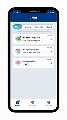
App Navigation Structure
Chats
The Chats page is further divided into 4 Chat Categories described below. Ears manage incoming and ongoing chats here, with each chat being given a unique ID and icon similar to their current platform.
Resources
Ears need easy access to resources to recommend to texters. An in-app page with Resource categories and Copy buttons is more convenient than perusing Info posters on the walls of the Ears Room.
Account
Here, Ears can change their Notification Settings and app preferences (Dark/ Light Mode). Ears with Board positions would have additional permissions and privileges tailored to their roles (e.g.: sending announcements).

Chat Categories

Mine

Pending
Ear's ongoing chats
New incoming chat requests

View-only
Shift partner's ongoing chats

Closed
Chats that have ended
Why separate Ongoing and Pending chats?
-
Provide a clear distinction between:
-
ongoing chats with new messages to respond to, and
-
new chat requests that need to be accepted
-
-
Draw attention to Pending chats so the Ear accepts them quickly and doesn't leave the new texter waiting, thereby preventing hangups.

Pending Alert
Pending Tab
Both Ears on shift get the "Pending" request alert on their phones.
Once accepted, the chat moves to the Mine tab on the device of the Ear who accepts it.
Why give an Ear (view-only) access to
their shift partner's ongoing chats?
-
Ears often help each other with chats.
-
Currently, a chat can only be accessed on the device on which it was accepted. The Ear taking the chat would have to scroll up and explain necessary context to the other Ear to seek their help, requiring them to briefly stop responding to the texter.
-
Having view-only access to their shift partner's chats allows the Ear to gain valuable context to help, without distracting the Ear taking the chat.
.png)
View-only
Why have a separate tab for closed chats?
The Heroku platform erases chat history at the end of the shift, forcing tired Ears to summarize and log chats right away even if they end at 4 AM. Ears need sleep and might provide rushed, incomplete responses or skip the Call Log survey altogether.
-
On the other hand, the Closed Chats tab:
-
gives Ear access to chat history for 24 hours, allowing them the flexibility to complete the Call Log at a convenient time.
-
alerts Ear to complete Call Log survey for each chat, directs them to the external Qualtrics link, and tracks whether the chat has been logged.
-
allows Ear to focus on ongoing chats during their shift.
-

Logging Chats
Once the Ear fills out the Call Log survey for a chat, it is marked Complete on this tab.
Ears can only delete a chat once it has been logged.

Deleting Chats
Lastly, Ears can also transfer their chats to other Ears.
-
If the Ear's shift ends, they can transfer an ongoing chat to an Ear on the next shift. Currently, Ears have to stay past the end of their shift or ask the texter to reconnect, and the next Ear loses all chat history.
-
Ears' mental wellness is also important! If the chat topic is triggering for the Ear, they can transfer the chat to another Ear who can handle the conversation.


Transfer Sequence
Clickable Prototype: Ears Mobile App
MATERIALIZE
Usability Testing with Expert Users: Ears Alumni

Tasks and Features Tested
-
Accepting a pending chat request
-
Viewing shift partner's ongoing chat
-
Transferring a chat to another Ear
-
Accessing the Call Log
-
Deleting finished chats
-
Finding a number for emergency services
Before each task, we asked them to describe:
-
how they would normally do the above, and
-
what they expected the app would do
"I used to feel so alone while taking a text... I feel SO supported by this app!"
Ears thought our app and its new features were clever and thoughtfully designed. But beyond that, their positive emotional responses to the design's capabilities were incredibly meaningful and fulfilling to hear!
Next Steps: Coding our design into reality!
I demoed our designs to current Ears during a board meeting, and their feedback was overwhelmingly positive.

When JumboCode first designed E4P's Heroku website back in 2018, they had a limited understanding of E4P's needs due to its anonymous nature and no access to internal data to inform their design.
Since my team's designs are backed by extensive research, design principles, and testing, E4P and JumboCode are interested in collaborating and implementing them over the next year.
My Role
Due to my involvement with Ears, understanding of this design project, and basic knowledge of coding, I can bridge the communication gap between all parties involved in this collaboration.
Reflections and Takeaways
The importance of user research: Despite having been an Ear for 5 years, I discovered many new insights into the Ear experience that I might not have thought to consider. I'm glad we conducted extensive user research instead of relying solely on my knowledge of how the organization works!
Mock interviews to refine our user research protocols: After brainstorming questions together, we interviewed each other to refine our phrasing and weed out unnecessary questions. I like using this technique to ensure that the actual interviews are professional and meaningful.
Mitigating bias during testing: Creating clickable mockups to simulate the experience of using a functional website helps reduce participants' bias when comparing with a clickable prototype during A/B Testing.
Project management skills: With her background in business, OnKee was an incredible project manager, and I learned a lot of skills from her that I got to implement in other projects.
Figma Components: I got so much better at Figma and using Components to create prototypes efficiently.
Personal Learnings: I love moderating focus groups and interacting with our target users. Also, when I care deeply about a project and its purpose, I put extra thought and effort into my work.
What I would do differently
Components: I would have created Component libraries during our project's initial wireframing to save time later when we added our Graphics Layer and refined our designs post feedback.
Separate prototypes: For our Capstone deliverable, our clickable prototype for the Ears app attempted to connect all of our new features in one, which got messy and confusing. I would have instead created several prototypes that demonstrated key features separately and effectively. I ended up making this change when I redid our prototypes for my JumboCode documentation.
Familiarizing my team with E4P: Having been an Ear for 5 years, I took for granted my understanding of some of the intricacies of the organization. My teammates were not as familiar with E4P, and I would have explained and demoed the Heroku platform and such much sooner to get us all on the same page.